Source: Freepik
The concept of color psychology is the most effective way for brands to compete, connect, and convert. The color of your product packaging is more than aesthetics. Beyond an appealing visual look, color drives trust, quality, and even perceived value of your product.
Put simply, color plays a crucial role in making or breaking the emotional connection between your product and customer. Read this blog to explore how to use color psychology in packaging design to elevate your brand identity and influence customer behavior.
Why Color Psychology Matters in Packaging?
Color psychology is a field of study that sheds light on how colors influence human emotions and behaviors, especially when it comes to buying products. When brands utilize colors thoughtfully, they become silent ambassadors for effective marketing.
Choosing the right color also acts as a silent storyteller that triggers a feeling or resonates with deep values of your target audience. This kind of resonance matters the most in today’s hypercompetitive landscape.
The blend of packaging color with packaging design and style is very critical to influence customer behavior and perception. It is important to know how different colors, such as blue packaging, creates an impact on customer engagement and brand loyalty.
Such as blue reflects trust and reliability, while red signals urgency and excitement. These signals happen fast, often before logic kicks in the customer’s mind. For example, Tiffany & Co. uses a unique dark, green-tinged blue rigid packaging popularly known as Tiffany Blue.
Following the rules of color psychology, Tiffany Blue has become a correspondent with luxury, exclusivity, and sophistication. This color combination on rigid boxes portrays elegance and luxury, making the Tiffany brand immediately recognizable in the jewelry and high-end gifts industry.
Likewise, your brand can buy printed rigid boxes wholesale, designed with the right color combination to remain a symbol of premium quality. With the right color psychology and packaging design, you build trust and refinement with your buyers.
Leverage Color Psychology for Your Product Packaging
Using the right color in packaging design triggers specific emotions, conveys a brand’s message clearly, and strengthens brand identity at first glance. To effectively leverage color psychology in product packaging, learn how colors evoke emotions and then choose hues accordingly, which ultimately resonates with your brand messaging and target audience.
Explore here how colors change the buying perception of customers and test your design choices with your potential buyers to ensure they perceive positively.
- Understand Color Combinations
Color psychology significantly impacts how customers perceive your products while influencing their emotions and overall experience. By understanding the psychology of color, your brand can create a memorable packaging experience that aligns well with your customers.
Here are common color combinations that you can apply thoughtfully to your product packaging and persuade customers to buy your product:
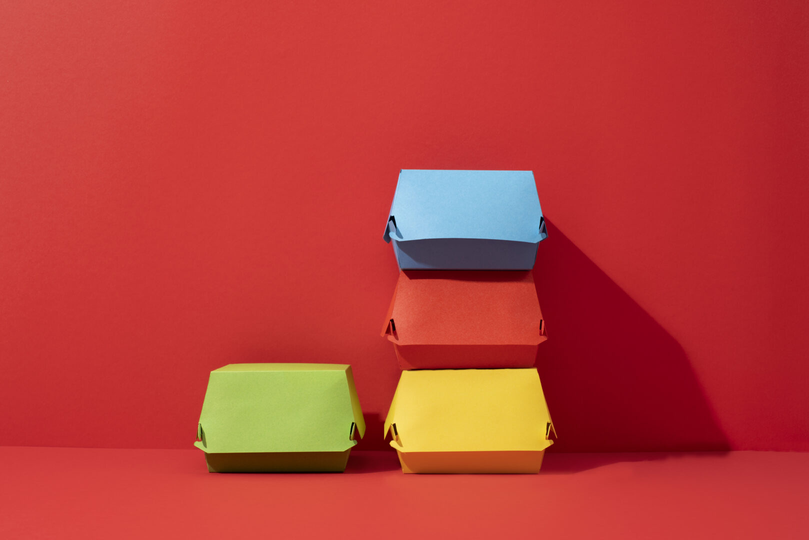
- Warm Colors (Red, Orange, Yellow): Symbolize energy, excitement, and warmth. These colors are used to grab attention and create a sense of urgency among customers.
- Cool Colors (Blue, Green, Purple): Conveys calmness, trust, and serenity. They can be used to build a sense of reliability and professionalism.
- Neutral Colors (Black, Gray, White): Often associated with sophistication, minimalism, and neutrality. They can be used to create a sense of balance and sophistication.
By incorporating these color combinations, your brand can also inspire unique gift packaging ideas that express enthusiasm or celebration. For example, use cool colors like blue and green to convey calmness, trust, and serenity, suitable for gifts meant to bring peace or thoughtfulness.
- Analyze Your Target Audience
When using color psychology in packaging, considering the target audience is significant for tailoring the color palette to resonate with their emotions and preferences. This involves considering factors like age, culture, and gender, as different groups may associate colors with varying meanings.
Research what colors resonate with your target audience (such as age, gender, and cultural background). Here’s a breakdown of key considerations:
- Age and Generation: Millennials and Gen Z are more drawn to vibrant colors like pink, yellow, and neon shades, reflecting their preference for individuality and trendiness. Similarly, consider what baby boomers and children prefer.
- Culture and Ethnicity: Certain colors have different meanings across cultures. Researching color preferences within specific regions or demographics can help tailor packaging designs to resonate with local consumers. For example, white symbolizes mourning in many Western cultures. However, this color is also associated with purity and celebration in some Eastern traditions.
- Gender: While traditional gender roles are evolving, some color associations are still commonplace. For example, pink is often associated with femininity, while black, blue, and grey are commonly used for masculine products.
It is significant to avoid generalizations and consider individual preferences within each gender group. Maintain a consistent color palette throughout the brand’s visual identity to strengthen brand recognition and create a memorable experience.
- Create Visual Hierarchy
Visual hierarchy and color psychology work together in packaging design to guide the consumer’s eye and highlight key information, influencing their perception and ultimately, their purchase decision. Use color to guide the viewer’s eye to important elements of the package.
For example, you can use a bold, vibrant color for the logo and then use more muted tones for other information. By strategically using color contrast, placement, and size, designers can create a clear visual hierarchy that directs attention to the most important elements on the package. Here are the strategic ways to create impactful visual hierarchy:
- Contrasting Colors: Use a high-contrast pairing, such as black and white or complementary colors, to immediately draw attention. Highlight important elements with a contrasting accent color against a dominant background color.
- Placement: Place the most important information, such as the brand name or product type, in a prominent position, such as the top or center of the package. Use spacing and whitespace to create visual breathing room and emphasize key elements.
- Size: Larger elements are naturally perceived as more important and draw more attention. Use size variations to create a clear visual hierarchy while directing the viewer’s eye to the most important information.
- Test and Iterate
Testing and iterating color choices in packaging design involves gathering feedback from target markets and refining designs based on those insights to ensure the packaging effectively resonates with consumers.
This process helps brands understand how colors evoke emotional responses and how they contribute to brand identity. Here is a step-by-step explanation:
- A/B Testing: Test different color combinations and layouts to see which ones resonate most with your target audience.
- Focus Groups: Gather feedback from potential customers to understand their reactions to your packaging design.
- Market Trends: Stay updated on current color preferences of potential buyers and how they might evolve over time.
Once your brand develops potential color schemes, it becomes necessary for you to test your packaging designs within target markets. Doing so will help you gather feedback from your audience and develop more emotionally connected designs to various color choices.
The Bottom Line
The importance of color in shaping customer perception and behavior cannot be ignored. As it influences everything from creating first impressions on customers to building emotional connections within.
In this regard, selecting a strategic color psychology becomes important for resonating with your target audience. Follow the steps mentioned in this blog to make the best use of color psychology and build a unique brand identity.