Most people don’t understand the design process or how to engineer a product. However, there is one aspect of design that is immediately, intuitively internalized by everybody: color.
Color theory is all about how people perceive color and what effect it can create on those who view it. Spoiler alert: the impact is massive. So if you’re making something for other people, understanding the basics of color theory is critical. In this article, we’ll walk you through everything you need to know about color and how to use it.
Why Color Matters
Whether it’s due to culture, evolution, or alchemy, people have strong reactions to and associations with specific colors. Warm reds and oranges bring up feelings of energy, passion, and intensity. Cool blues and purples can be calming, relaxing, and reserved. There are many more combinations and entire books on these relationships.
When you’re designing something the colors you choose will create a certain effect on your viewers, whether intentionally or otherwise. It doesn’t matter what you are designing, a product, a logo, an advertisement, a webpage – anything. It is all impacted by color choices. A smart product manager or company owner knows that intentional is the way to go. After all, you want to have control over how your brand and product are viewed. That’s why it’s so important to be mindful and deliberate when it comes to color choices.
A Crash Course in Color Theory
To put it simply, color is the perception that is created in our brains when objects reflect light of varying wavelengths into our retinas. We create artificial color (screens) by generating specific light. The most common way to organize color is on a wheel, an illustrative model that shows colors in a circle. We break the colors on the wheel into three types: primary, secondary, and tertiary.
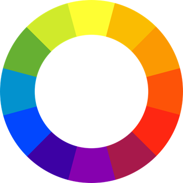
Source: https://commons.wikimedia.org/wiki/File:BYR_color_wheel.svg
The primary colors are red, blue, and yellow. The secondary colors are orange, green, and purple. Tertiary colors include red-orange, yellow-orange, yellow-green, blue-green, blue-violet, and red-violet. Secondary colors are made by mixing primary colors and tertiary colors are made by mixing primary and secondary colors.
If you split the wheel down the middle, you’ll have warm and cool colors. Warm colors are reds, oranges, and yellows. Cool colors are blues, greens, and purples. This is called temperature.
Colors on the wheel have certain relationships with each other which are called color harmony or color schemes. Colors on opposite sides of the wheel, like red and green, are complementary colors. Three colors next to each other on the wheel, like yellow-green, yellow, and yellow-orange, are analogous colors. Three colors spaced equally apart from each other on the wheel, like orange, purple, and green, are triadic colors.
Complementary Colors:
Source: https://en.wikipedia.org/wiki/Complementary_colors
Analogous Colors:

Source: https://commons.wikimedia.org/wiki/File:ART_ANALOGOUS_COLOR.png
Triadic Colors:
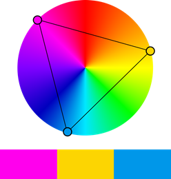
Source: https://commons.wikimedia.org/wiki/File:Triadic_colors.png
And off the color wheel completely are the neutral colors: black, white, grays, tans, and browns.
Color theory also involves hues, tints, shades, and tones of the different colors. A hue is any color on the color wheel. A tint is a hue plus white, like pink (red plus white). A shade is a hue plus black, like maroon (red plus black). Tones are created by adding gray, which changes the intensity of hues.

Source: https://en.wikipedia.org/wiki/Shades_of_blue
Color in Design
In design and art, there are two models of color mixing: RGB and CMYK. RGB refers to red, green, and blue and applies to computers, TVs, and electronics. RGB is an additive model.
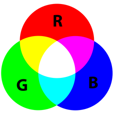
.png)
The CMYK model is used for printing. This refers to cyan, magenta, yellow, and K is for black. This is a subtractive model that creates colors by absorbing certain wavelengths of visible light and reflecting others.

Source: https://en.wikipedia.org/wiki/CMYK_color_model
In their work, designers will have to use one or both models depending on the product they’re creating. Files made for screens and files made for printing require different color models in the file to create accurate results.
Designers working with color have to use all of the information above as the starting point. This includes the wheel, color schemes, color temperature, hues, tints, shades, tones, color models, and so on. In addition to this, designers need to have an understanding of how colors are perceived and how they influence people. This allows them to create the desired effect in branding and marketing.
How Color Impacts Viewers
So, with the technical stuff out of the way, how does color impact viewers, anyway? Well, in a lot of different ways. Like we covered above, the two color temperatures create very different feelings and impressions. If you want your customers to associate your brand with professionalism and composure, you may want to choose a cool color in your logo. On the other hand, a dating app all about love and passion should use warm colors.
Further, color harmony is important in creating certain effects. Complementary colors are a great way to make things pop and stand out. Similarly, triadic colors have a dynamic effect that stands out. In contrast, analogous colors create a sense of visual unity which is really pleasing to the eye.
Colors create responses in people in a fairly typical way. For example, blue is thought to diminish appetite, while red and yellow are known to do the opposite. Hence the colors of all of your favorite fast food logos. People consider yellow as energizing while purple is relaxing and almost sleep-inducing. And, of course, as stereotypical as it may be, consumers will tend to associate pink with femininity and blue with masculinity. This is especially true in certain contexts, like toys.
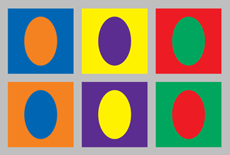
Examples of Strong Color Use in Design
Once you have a basic knowledge of color theory in your back pocket, you’ll start to notice it in ads and media everywhere. Here are just some of our favorite examples of strong color choices in graphic design.
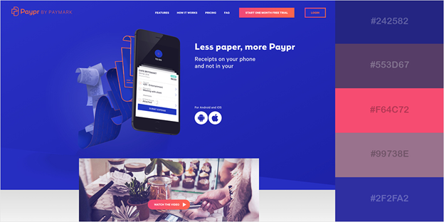
Source: https://visme.co/blog/website-color-schemes/
Here, Paypr uses complementary and analogous colors. The different shades of blue and purple offer authority and trustworthiness. At the same time, the pink adds a pop and inviting playfulness.
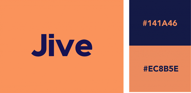
Source: https://looka.com/blog/logo-color-combinations/
This logo does a perfect job of using complementary colors to balance a sense of playfulness and energy with power and authority.
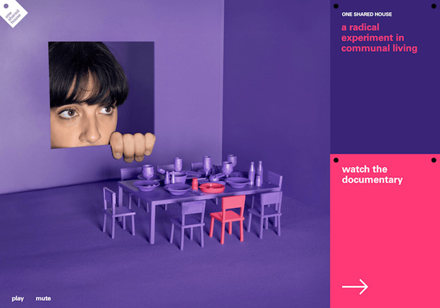
Source: https://www.smashingmagazine.com/2010/01/color-theory-for-designers-part-1-the-meaning-of-color/#top
Above is a website advertising a documentary about a collaborative living space. It uses bold and creative analogous colors pink and purple to create an effect that is vibrant, daring, and energetic.
Now go forth and put that color knowledge to work already!